The History of Voronoi Diagrams
- Dec 7, 2020
- 1 min read
Updated: Dec 17, 2020
In 1854, John Snow created a map of London showing cholera cases and their proximity to water pumps. A hallmark of epidemiology, John had laid the foundations for Voronoi diagrams in the field of medicine.

In 1854 London, there was a large cholera outbreak.
In 1854 London, the dominant theory at the time was that people were being infected by contaminated air from open sewers, but a doctor named John Snow (unrelated to Westeros) thought differently: it was being spread through contaminated drinking water (Thomas). In hopes of proving his theory, Snow created a map which marked cholera deaths with black bars, and had a border that showed the area that was closest to a particular water pump (Austin). The map showed that most of the deaths occurred in the households closest to the Broad street water pump (Thomas), so the Broad street pump was closed and the outbreak ended soon after (Austin). Creating a visual of sites (in this case water pumps) and marking the area of locations closest to each site is called a Voronoi diagram.

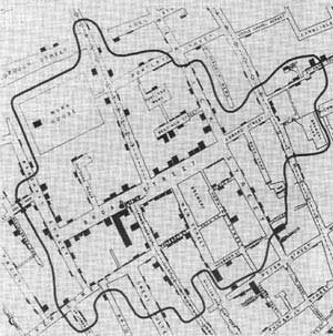


Creating a visual of sites and marking the area of locations closest to each site is called a Voronoi diagram.
Resources
Austin, David. “Voronoi Diagrams and a Day at the Beach.” American Mathematical
Society, Aug. 2006, www.ams.org/publicoutreach/feature-column/fcarc-voronoi.
Thomas, Rachel. “Uncovering the Cause of Cholera.” Plus.maths.org, 12 Feb.


Comments